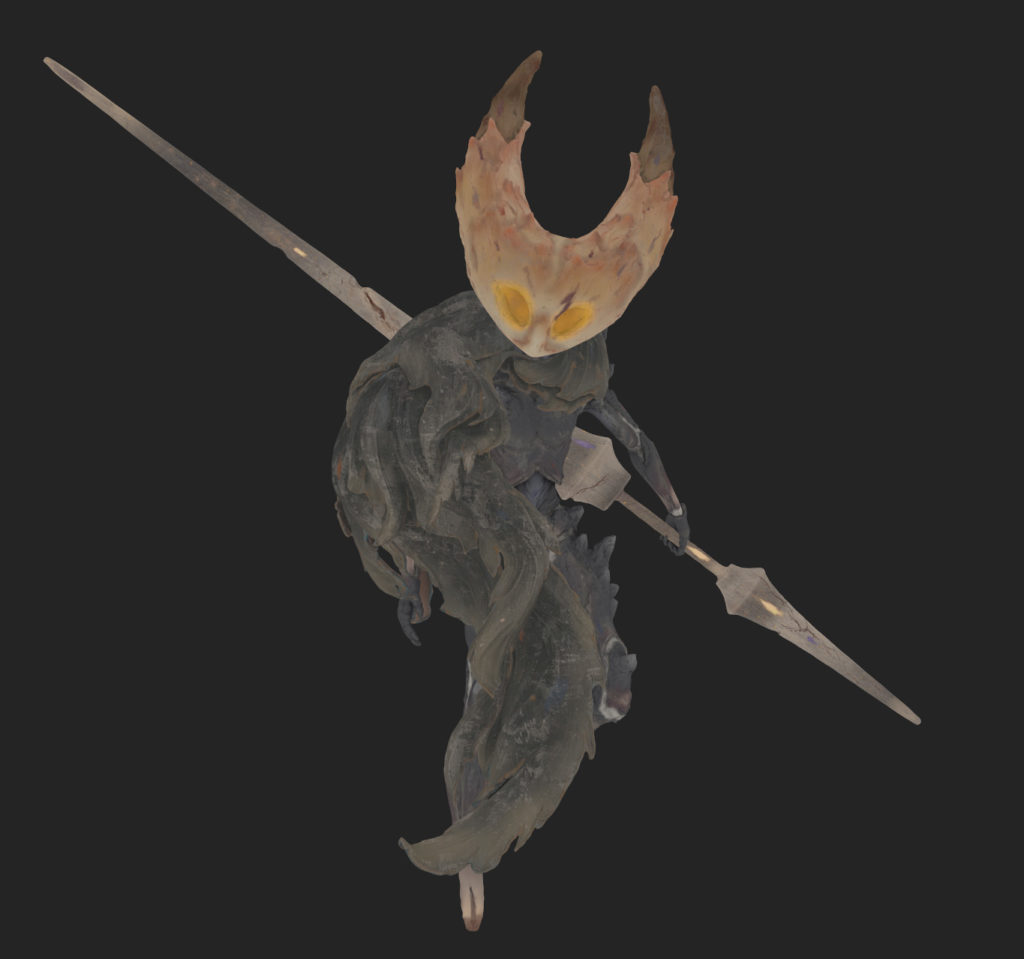
I have a big passion for creating my own designs and bringing them to life through 3D. In the following article, I will give you a breakdown of my most recent project, The Hollow Knight – Children of the pale King.
Preparation
I had the idea for this project already a long time ago. As a huge fan of Hollow Knight, it was always a dream of mine to create my own fanart of the game. Since I was planning to work on my sculpting skills this year, I thought it was the perfect opportunity to make the idea into reality.
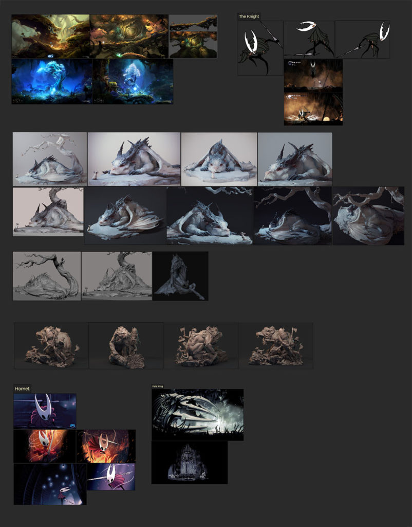
For the style, I decided to take a more artistic approach. I looked up many great digital sculptors on Artstation and decided to take inspiration from sculptors like Maria Panfilova or James W Cain. I also looked at the game Ori, which gave me a lot of inspiration for the Roots later on.
When gathering references, I usually try to take my time and look for many different inspirations for my project. This helps me to get a clear image of what I actually want to sculpt in the end. In this case, I spend a lot of time looking at sculptures.
Sculpting
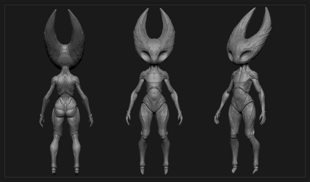
For this Project, I started with a human anatomy model which I slowly sculpted into a more interesting shape. I blocked out many different versions until I had a design that was to my liking. In this early stage I work with a very low polycount to determine the primary shapes and the Silhouette, here I try to not get distracted by small details.
As soon as I have my primary and secondary shapes established, I usually stop using Dynamesh. I proceed to copy the mesh and ZRemesh the original. Afterwards, I create multiple subdivisions and reproject my details from the copy on top of the remeshed mesh. I highly recommend working this way since it will allow you to work with multiple poly densities.
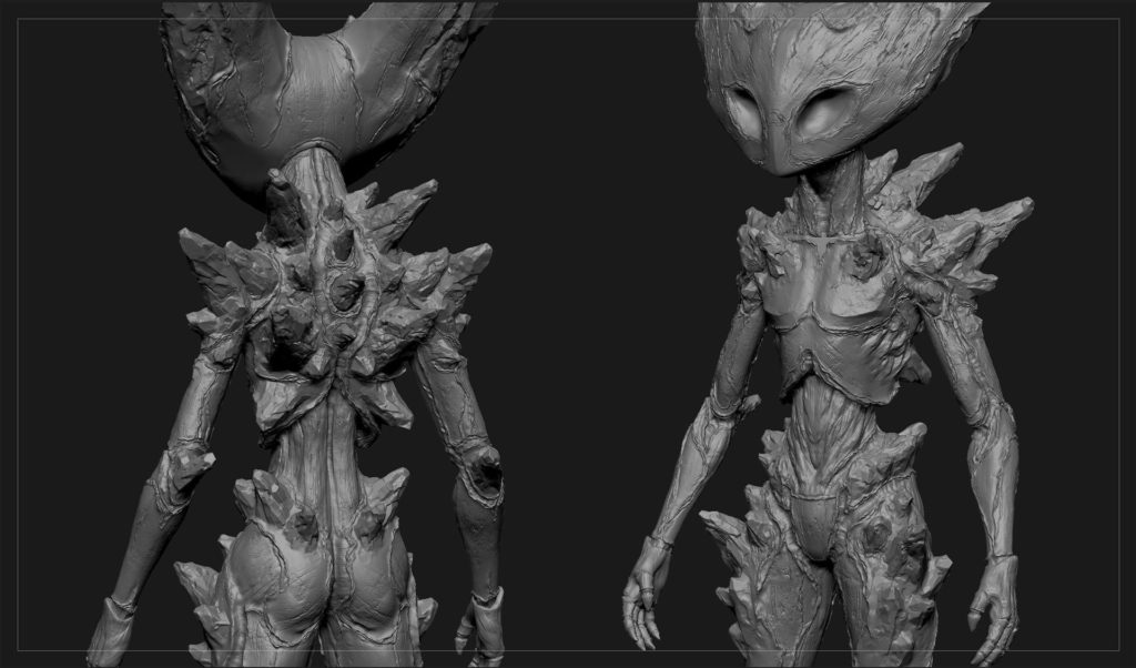
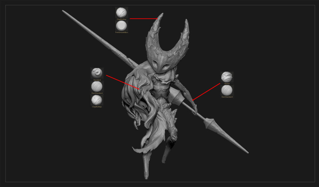
For the Detailing stage, I experimented with many different patterns. Since the Creatures from Hollow Knight are based on Insects, I looked at many different types of Insect shells. In the end, I decided to use a combination of chitin and wooden textures. Here, I made heavy use of the Slash2 Brush. This brush creates a layering effect, which is very useful for organic structures.
Defining the Pose
After I was happy with the high poly I started posing the Character with the ZBrush build-in plug-in Transpose Master. This is where the subdivisions come in handy. It allows us to work with a combined mesh on a low subdivision level. That gives us a lot more control when posing the asset.
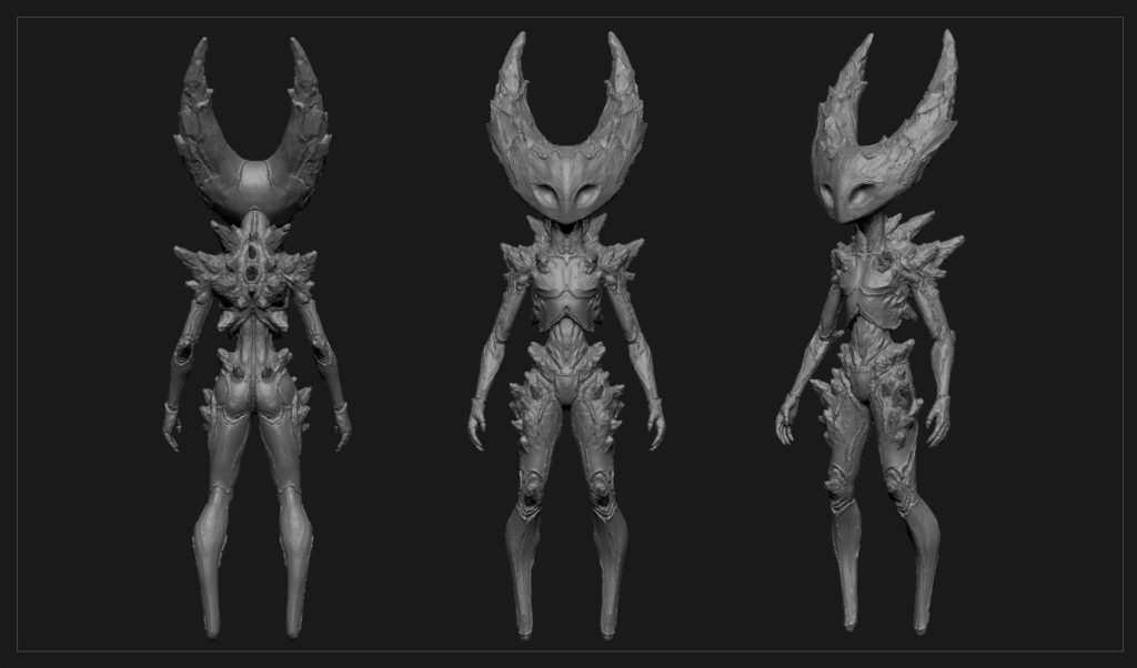
It was a very fun stage, playing around with many different dynamic poses. After Hornet was in place, it was time to create the second Character. For that, I had initially planned to go with the protagonist of the game. But after giving it more thought, I came to the conclusion that the Knight would fit better with Hornet composition-wise, especially since both have a similar head shape.
When designing the Knight, I didn’t want to copy the same style from Hornet, so I played around with many different ideas. Since The Knight in the game is affected by some form of corruption. I decided to make it visually manifest in some way on his body. So I came up with the idea of rocks growing out of his skin, breaking out of the insectoid plates on his body.

Cloth
I had many different Ideas on how to approach the capes. In the beginning, I wanted to have a more realistic style, but it became soon apparent that it would be better to go for a more stylized direction.
I started by deforming some one-sided planes to get the overall structure in. The SnakeHookBrush helped me a lot in this stage since it allowed me to create very dynamic shapes. When I was happy with it, I ZRemeshed everything and applied thickness with the Panel Loops tool in ZBrush, and finally, I added some subdivisions to start sculpting in some details.
To sculpt the folds, I mainly used the StandartBrush and occasionally the DamStandartBrush. I personally believe that you don’t need a huge arsenal of different brushes. Mastering one or two brushes for one purpose is enough, in my opinion.

Diorama
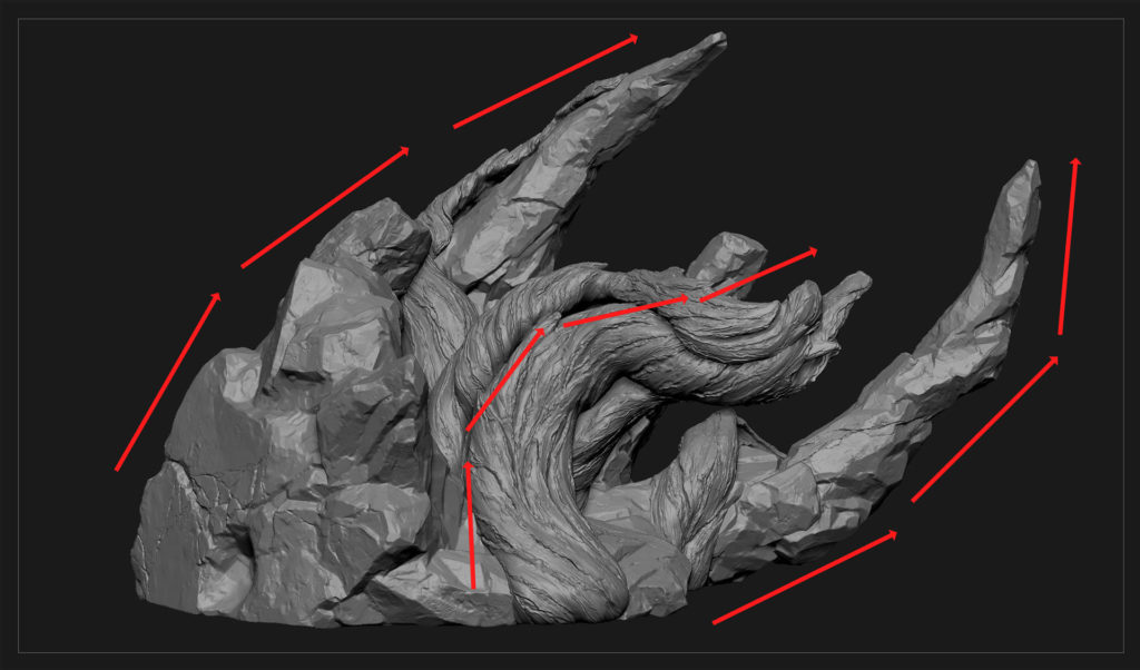
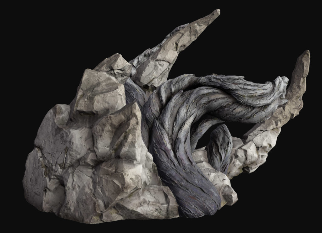
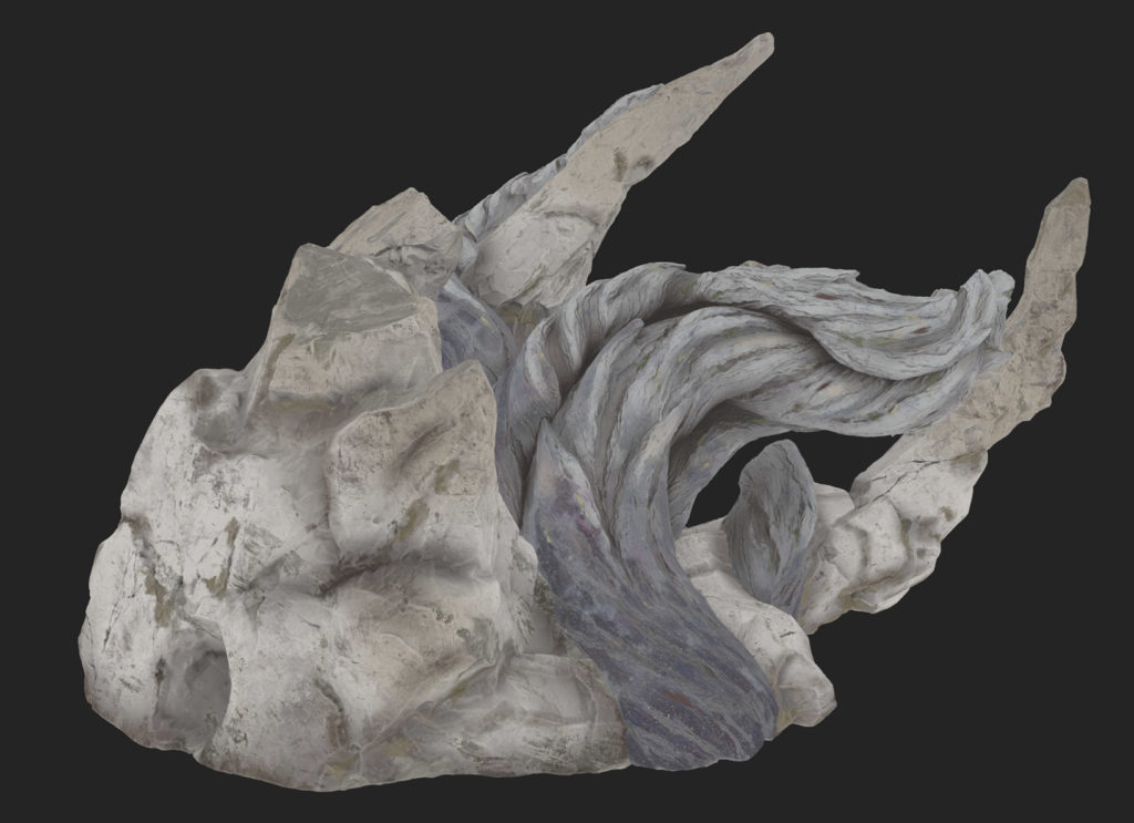
I asked many of my friends for their input and ideas regarding the diorama. I already had the crown and the Veins in place, but I wasn’t too happy with the early compositions. It took quite some time to realize that the crown would create some amazing directional lines if I tilted it a bit. With the base in place, I could start sculpting the details.

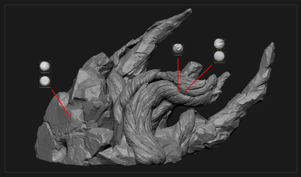
For the Veins, I used the SnakeHook Brush to block in some dynamic forms for the silhouette. After that, I started to create secondary and tertiary details. Here I made heavy use of the Slash2 brush again. Moving on to create the main shape of the crown, I used the ClayBuildup and the Move Brush. After I was happy with that, I progressed onto the Detailing stage, where I made heavy use of the TrimSmoothBorderBrush, which is in my opinion the best brush for rock type surfaces.

Texturing
Initially, the project was meant to end here since this was only supposed to be a sculpting practice. It was only later on that I decided to texture it fully and properly render it out.
Looking for references
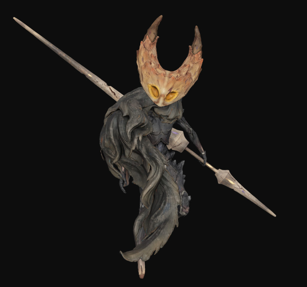
I looked at many different types of sculptures when looking for new references for the texturing stage. Some of my main inspirations came from Beth Cavener, Shan Ren, Maria Panfilova and Zhelong Xu. They create unique textures for their sculptures which I tried to imitate for my project.
While working on the materials, I often switch between the different views in Substance painter. The Base Color view was very important to achieve that painted look.


Something I try to incorporate into all my projects are interesting gradients. Not just for different light and dark values but also for colors. In my earlier works, I was scared to make use of that, but I think that experimenting with them can really make your project shine and stand out a lot more. A good example is the roots, where I decided to go with a rather unusual color palate.
I studied some guides and books by James Gurney to learn more about color theory and light. I highly recommend checking out his work if you want to get an in-depth look into this topic.


Smart Materials in Substance Painter
At the beginning of my texturing process, I usually start by applying some base materials. This is where I determine my main color scheme and roughness values.
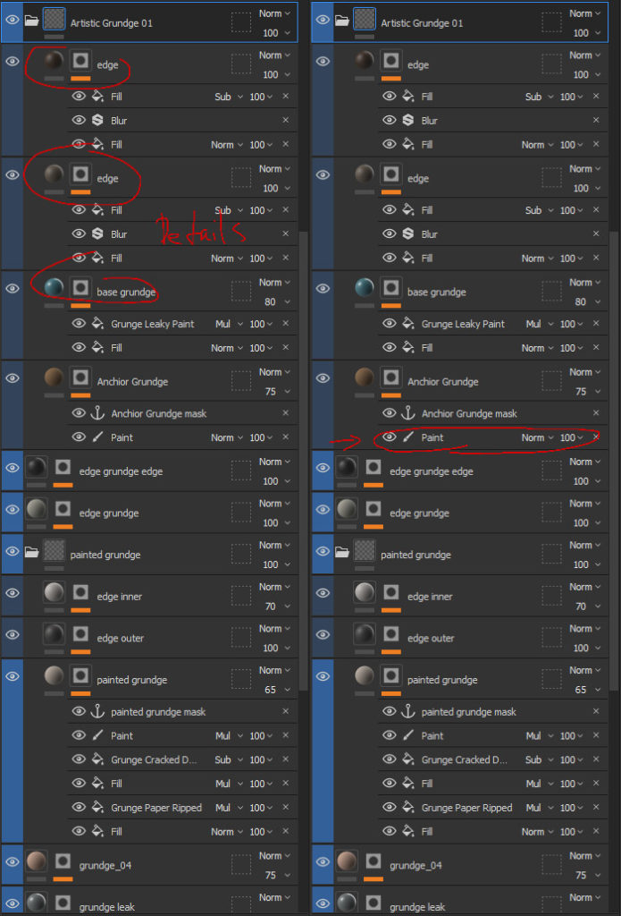
When I am happy with the base, I usually continue by creating my own Smart Materials. To do that, I start by creating a fill layer with a paint mask and an anchor point. Then it is just a matter of stacking details on top of the layer and connecting them with the anchor point. This way allows me to create a lot of layered details with just one paint stroke. Be careful, though, not to overdo it with the layers since it will slow down your pc significantly.

Lighting and Composition
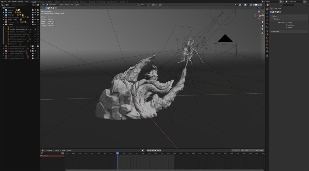
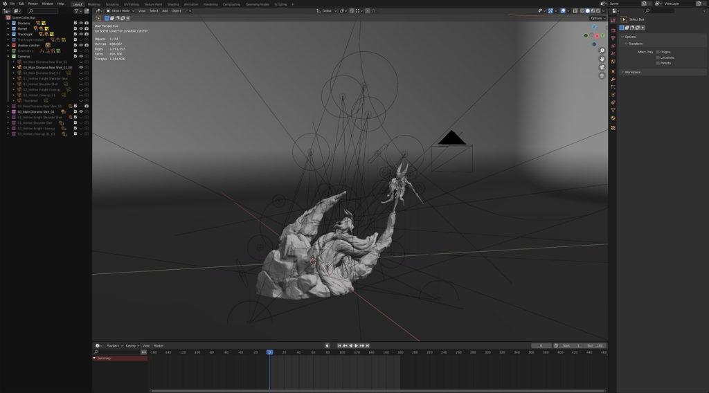
For the lighting and rendering stage, I used the cycles render engine in Blender. When working on my lighting setup, I usually start by setting up a primary light source to illuminate the scene. After that, I create a secondary light source to create some rim lights. From here on, I move onto the detail stage, where I create very subtle but impactful lights to highlight specific areas I want to emphasize.
For every shot I take, I create a custom lighting setup. It is a bit tedious to do, but it really helps to bring those last percentages out of your projects. Especially at the end of the road, you grow tired and just want to finish the project, but I believe it is here where you have to give it your all to achieve a good and satisfying result. It happened to me more than once that I grew impatient and just uploaded a half-finished project, only to regret it afterward.


Conclusion
I want to thank you for taking the time to read this small article, and I really hope that it gave some insight into the development of this project. I had a lot of fun creating this Diorama and learned a lot in the process.
I am still developing my skills and working on improving my workflows, so a lot of things might change in the future, but I am very happy with the result I was able to achieve with this project, and I hope to improve on it moving on.
Finally, I would like to thank Vertex Mode for giving me this excellent opportunity to talk about the creation of this project.
